
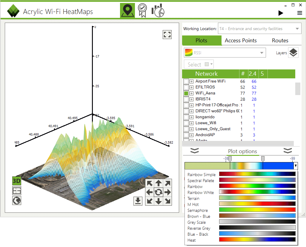
3D WiFi Coverage map, heatmaps and isolines
WLAN coverage map representations are usually made with 2 dimension imaging to show signal level. Acrylic Wi-Fi Heatmaps has come up with 3D heatmaps generation to improve information and signal isolines visualization.
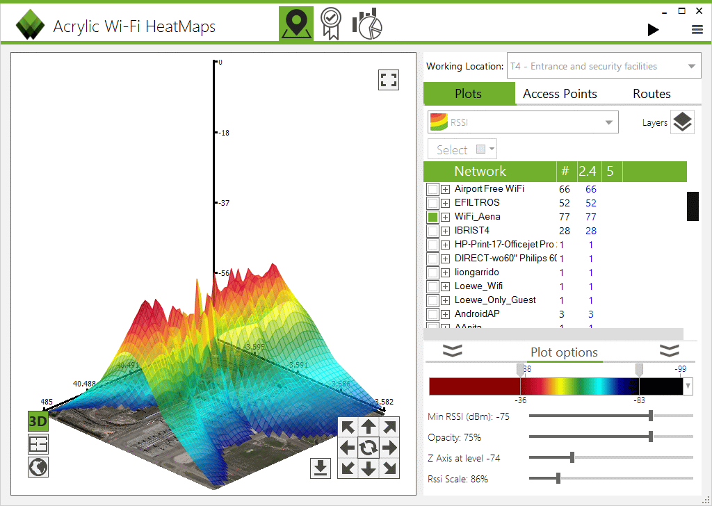
Image axis and visualization parameters are fully customizable, although some default values are present to get a well all-cases information display.
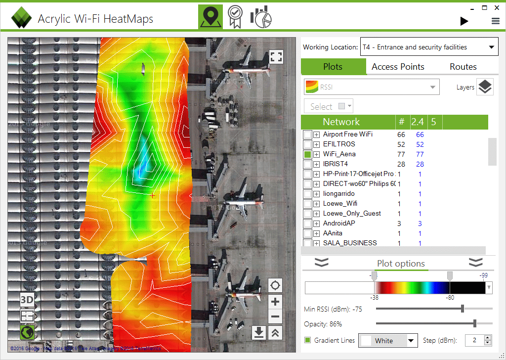
WLAN coverage map and isolines
Acrylic Wi-Fi Heatmaps coverage map editor allows some different graphic options, making Acrylic one of the most powerful WiFi monitoring tools in the market to make site survey analysis.
Next image shows a two-dimensional WiFi coverage heatmap like the ones you’ll find attached on Acrylic’s WiFi reports. It’s been specifically chosen because of its small gap between maximum and minimum RSSI or WiFi signal level, its a very usefull WLAN coverage map.
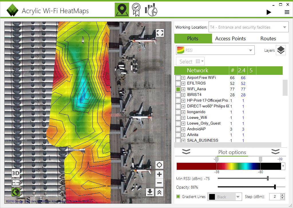
Using gradient analysis algorithm, Acrylic Wi-Fi Heatmaps is able to display equipotential isolines or WiFi level curves and show graphically WiFi signal fluctuation, helping users to identify poor WLAN coverage areas where VoIP or data applications performance could be affected.
More information at Acrylic Wi-Fi Heatmaps product page and at our blog, with more news about WiFi.